▶ 문제🔎
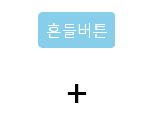
1. 마우스를 올리면 흔들리는 버튼 만들기
2. 마우스를 올리면 회전하면서 커지는 + 기호 만들기
(좌측 회전 → 우측 회전 + 약간 커지기 후 유지)
[HTML]
<!DOCTYPE html>
<html>
    <head>
        <meta chatset="UFT-8">
        <title>Document</title>
        <link href="layout.css" rel="stylesheet">
    </head>
    <body>

        <div>
            <button class="ani-btn">흔들버튼</button>
            <h3 class="ani-plus">+</h3>
        </div>
    </body>
</html>
[CSS]
.ani-btn {
    padding: 10px;
    background-color: skyblue;
    color: white;
    border: none;
    border-radius: 5px;
    font-size: 20px;
    cursor: pointer;
    /* 가운데 정렬 */
    display: block;
    margin: 20px auto;
}

.ani-btn:hover {
    animation-name: shake;
    animation-duration: 0.5s;
    animation-iteration-count: 2;
    /* iteration은 반복 횟수 */
}

@keyframes shake{
    0% {
        transform: translateX(0deg);
    }
    25% {
        transform: rotate(-10deg);
    }
    50% {
        transform: rotate(10deg);
    }
    75% {
        transform: rotate(-10deg);
    }
    100% {
        transform: translateX(0deg);
    }
}

.ani-plus {
    margin: 10px;
    font-size: 50px;
    text-align: center;
    cursor: pointer;
}

.ani-plus:hover {
    animation-name: 회전후커지기;
    animation-duration: 0.5s;
    animation-fill-mode: forwards;
    /* fill-mode는 마지막 상태 유지 */
}

@keyframes 회전후커지기 {
    0% {
        transform: rotate(0deg);
    }
    25% {
        transform: rotate(-15deg);
    }
    100% {
        transform: rotate(45deg) scale(2);
    }
}
': ) Web > 웹 스터디' 카테고리의 다른 글
| [HTML, CSS] [실습] transition & animation으로 navbar만들기 (0) | 2023.12.15 |
|---|---|
| [HTML, CSS] navbar에서 위쪽 여백 없애기 (0) | 2023.12.15 |
| [HTML, CSS] [이론] transform & animation으로 애니메이션 만들기 (0) | 2023.12.15 |
| [Sass 실습3] Bootstrap을 이용한 컬럼 레이아웃 만들기 (mixin, nesting 문법 이용) (0) | 2023.12.14 |
| [Sass 실습2] extend, mixin 문법을 이용해 alert 박스 만들기 (0) | 2023.12.13 |


