[Bootstrap v5.1]
✅ 반응형 레이아웃 만들 때 빨라서 부트스트랩 사용하는 것!! 미디어 쿼리 등 필요 없다.
⭐ row : 내부를 12칸으로 쪼개주는 class명
⭐ col : 행 쪼개기
- 정확히 쪼개고 싶으면 col-4 (정확히 4등분)과같이 하기.
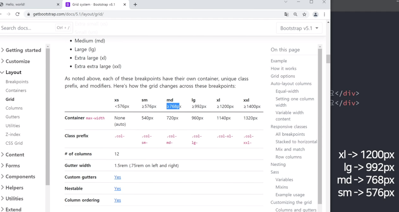
⭐ col 이용해 가로로 쪼갠걸 반응형으로?
- 조건문 더하기
- md사이즈 : 768px 등
⭐ PC사이즈에선 가로로 3열 모바일에선 가로로 1열 ?

▶ 더 많은 예시는 Bootstrap 홈페이지의 Layout 메뉴에 있다.
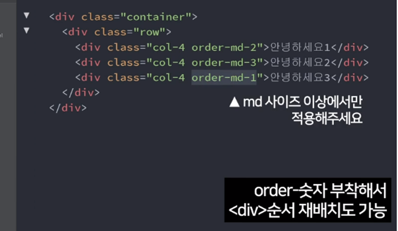
⭐ order-first를 이용해 <div>순서 재배치도 가능하다.
[결과 화면]

[HTML]
<!doctype html>
<html lang="en">
  <head>
    <meta charset="utf-8">
    <meta name="viewport" content="width=device-width, initial-scale=1">
    <link href="https://cdn.jsdelivr.net/npm/bootstrap@5.1.3/dist/css/bootstrap.min.css" rel="stylesheet" integrity="sha384-1BmE4kWBq78iYhFldvKuhfTAU6auU8tT94WrHftjDbrCEXSU1oBoqyl2QvZ6jIW3" crossorigin="anonymous">
    <title>Hello, world!</title>
  </head>

  <body>
    <div class="row">
        <div class="col-lg-3 col-md-6"> <div class="card" style="width: 18rem;">
            <img src="photo1.jpg" class="card-img-top" alt="...">
            <div class="card-body">
              <h5 class="card-title">Card title</h5>
              <p class="card-text">Some quick example text to build on the card title and make up the bulk of the card's content.</p>
              <a href="#" class="btn btn-primary">Go somewhere</a>
            </div>
          </div> </div>
        <div class="col-lg-3 col-md-6"> <div class="card" style="width: 18rem;">
            <img src="photo2.jpg" class="card-img-top" alt="...">
            <div class="card-body">
              <h5 class="card-title">Card title</h5>
              <p class="card-text">Some quick example text to build on the card title and make up the bulk of the card's content.</p>
              <a href="#" class="btn btn-primary">Go somewhere</a>
            </div>
          </div> </div>
        <div class="col-lg-3 col-md-6"> <div class="card" style="width: 18rem;">
            <img src="photo3.jpg" class="card-img-top" alt="...">
            <div class="card-body">
              <h5 class="card-title">Card title</h5>
              <p class="card-text">Some quick example text to build on the card title and make up the bulk of the card's content.</p>
              <a href="#" class="btn btn-primary">Go somewhere</a>
            </div>
          </div> </div>
        <div class="col-lg-3 col-md-6"> <div class="card" style="width: 18rem;">
            <img src="photo4.jpg" class="card-img-top" alt="...">
            <div class="card-body">
              <h5 class="card-title">Card title</h5>
              <p class="card-text">Some quick example text to build on the card title and make up the bulk of the card's content.</p>
              <a href="#" class="btn btn-primary">Go somewhere</a>
            </div>
          </div> </div>
      </div>

    <script src="https://cdn.jsdelivr.net/npm/bootstrap@5.1.3/dist/js/bootstrap.bundle.min.js" integrity="sha384-ka7Sk0Gln4gmtz2MlQnikT1wXgYsOg+OMhuP+IlRH9sENBO0LRn5q+8nbTov4+1p" crossorigin="anonymous"></script>


  </body>
</html>
[기본 뼈대]
<div class="row">
  <div class="col-lg-3 col-md-6"> 카드레이아웃 복붙 </div>
  <div class="col-lg-3 col-md-6"> 카드레이아웃 복붙 </div>
  <div class="col-lg-3 col-md-6"> 카드레이아웃 복붙 </div>
  <div class="col-lg-3 col-md-6"> 카드레이아웃 복붙 </div>
</div>': ) Web > 웹 스터디' 카테고리의 다른 글
| [HTML/CSS] 크롬 개발자 도구를 이용한 오류 수정 / 알 수 없는 Padding 제거 (0) | 2023.12.13 |
|---|---|
| [HTML/CSS] 경로설정 오류 Refused to apply style from~is not a supported stylesheet MIME type, and strict MIME checking is enabled. (0) | 2023.12.13 |
| [HTML, CSS 실습] 반응형 레이아웃 만들기 - 쇼핑몰 레이아웃 (0) | 2023.11.19 |
| [HTML, CSS] 반응형 레이아웃 만들기 (media query 문법) (2) | 2023.11.19 |
| [HTML, CSS 실습] flex-grow 속성 이용해 상단바 만들기 (0) | 2023.11.19 |

