- float와 inline-block은 귀찮음
📌 display: flex 쓰면 박스 가로 배치가 쉬워진다.
- display: flex를 부모에 주면 된다.
- 자동으로 가로 배치
- display: flex는 display: inline-block과 table요소를 합친 것 같다.
- 600px해도 실제로 600px이 아니라
- 최대한 600px이다. (테이블 폭과 비슷)
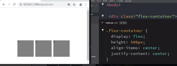
✅ justify-content: center
- 가운데 정렬
.flex-container {
    display: flex;

    /* 가운데 정렬 / 우측은 flex-end / 좌측은 flex-start...*/
    justify-content: center;
}
✅ flex이용 시 세로 배치
- flex-direction
- column : 세로 / row : 가로
.flex-container {
    display: flex;

    /* 가운데 정렬 / 우측은 flex-end / 좌측은 flex-start...*/
    justify-content: center;

    /* 가로/세로 배치 설정 */
    flex-direction: row;
}
➡️ 나중에 반응형 디자인 할 때도 유용하다.
[flex-direction: column일 때]

✅ flex-wrap: wrap
- width 크면 밑으로 보내고 싶을 때 (요소가 밑에 줄로 내려감)
✅ align-items: center를 통해 상하정렬 가운데
- align-items: center / flex-end…등;
- 보기 위해 height추가
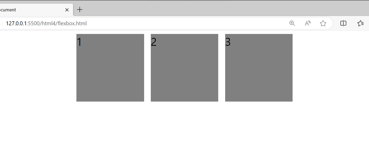
✅ flex-grow : 몇 배수를 차지하게 해주세요
- width 말고 다르게 주는 방법
- 박스 크기를 비율로 설정 가능
<div class="flex-container">
    <div class="flex-item" style="flex-grow: 1;">1</div>
    <div class="flex-item" style="flex-grow: 2;">2</div>
    <div class="flex-item">3</div>
</div>
➡️ 2번 박스는 1번 박스의 두 배로 (최대한 두 배로)

': ) Web > 웹 스터디' 카테고리의 다른 글
| [HTML, CSS] 반응형 레이아웃 만들기 (media query 문법) (2) | 2023.11.19 |
|---|---|
| [HTML, CSS 실습] flex-grow 속성 이용해 상단바 만들기 (0) | 2023.11.19 |
| [HTML, CSS] 웹 폰트(커스텀폰트) 넣는 방법 / anti-aliasing (0) | 2023.11.19 |
| [HTML, CSS] pseudo-class 로 클릭 시 스타일 바꾸기 (0) | 2023.11.19 |
| [HTML, CSS 실습] Table 레이아웃을 이용해 쇼핑 카트 화면 만들기 (2) | 2023.11.19 |


